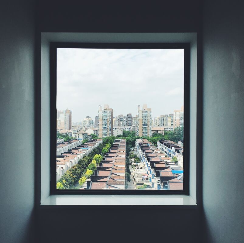
The geographic simplicity and beauty of the square lies in its balanced proportions and equal sides. This format simplifies the composition, allowing the viewer to focus on the control elements without the distraction of elongated dimensions. The square relaxes the viewers gaze, as the central theme is clear as the format is balanced.
With this format, the photographer is forgiven for applying a simple composition to their shot. Putting the subject square in the middle of the frame is a very justified and acceptable choice. Sure the photographer can still use rules of thirds in a square format, but they are not forced to. Everyone will understand the simplicity of placing the subject in the middle, allowing the viewer to quickly understand the focal point and the message being conveyed.
With this format, the photographer is forgiven for applying a simple composition to their shot. Putting the subject square in the middle of the frame is a very justified and acceptable choice. Sure the photographer can still use rules of thirds in a square format, but they are not forced to. Everyone will understand the simplicity of placing the subject in the middle, allowing the viewer to quickly understand the focal point and the message being conveyed.
|
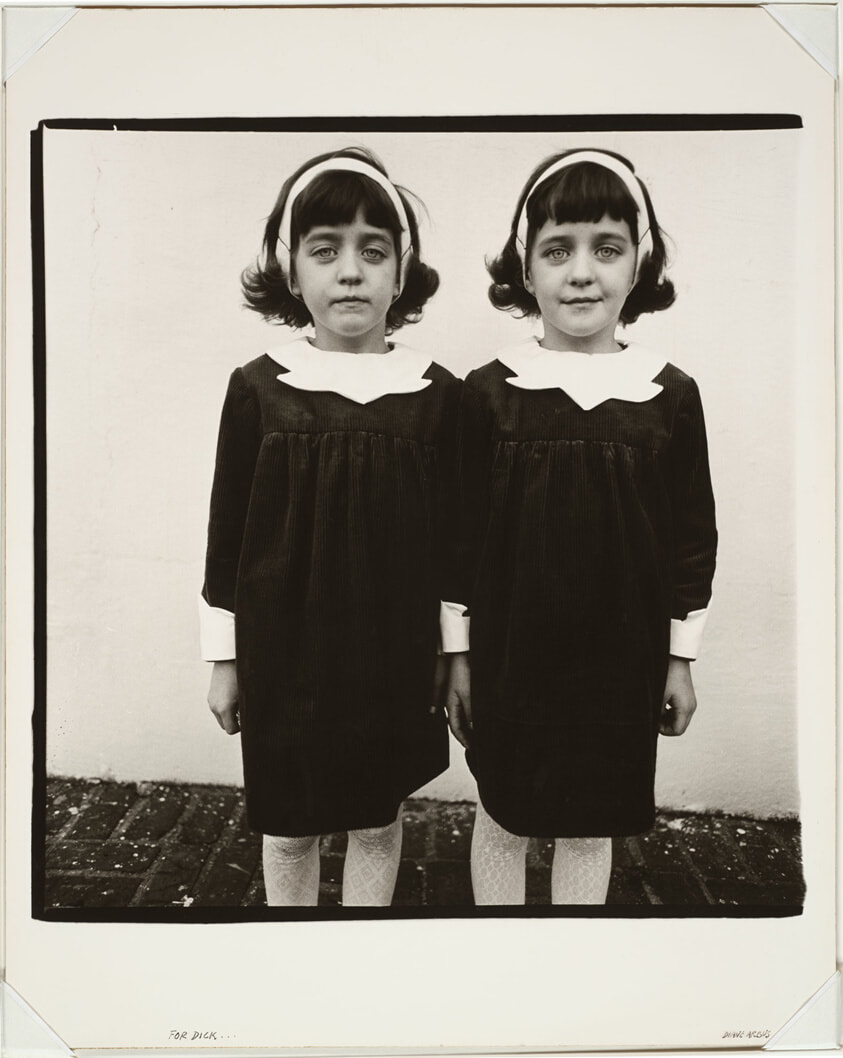
To the left we have an image taken by Diane Arbus and gifted to Richard Avedon. The subject is her famous twins, and as we get flashbacks to Stephen King novels, we are also hit with the simplicity of the composition. Diane did not make us work for the subject matter. There are no playful use of rules of thirds. There is no tension building placement of the subject on the edge of the frame. It is there...clear as day.
And what a powerful way to convey and image. Simple, symmetrical and clear. This is one reason that Diane Arbus images of "freaks" is so powerful, as we cannot escape them. They are there, right in our frame of view, we cannot avert our eyes for we would have to change direction. The only way to get to where we want to go is to look straight ahead and accept the aristocracy of the freaks, to look upon them as equals before moving on. This unapologetic force in composition is a wonderful tool. In the right hands it has changed the world but just as any powerful weapon, how it is used is critical to success. If you have a poor subject, there is no covering it up. No wide angle to get the viewer to lose themselves and skip over the image without comment. In a square format you must succeed or fail, there is no in between. |
We can wax poetically on the virtues of the square format all day but we are here to understand how best to use such a format. To begin with, I am working under the assumption that the camera is limited to a square format. If this is not the case, you have to decide which composition is best....which is the strongest way to view the image.
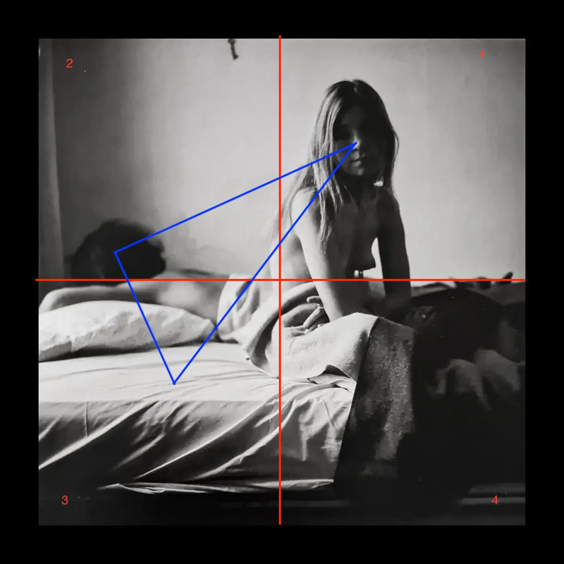
Here we have another of Diane Arbus images (see the deep dive analysis of this image HERE). We e have the subject of a young lady in quadrant 1. She sits to one side of the overall image and her face, being the only one facing us, is where our eyes go to first. We are drawn to human faces and are trained to look here first. But then where does the eye go? It goes to the light. Where is the brightest portion of the image? To her back and sheets. Where does it go next? Context...it looks for context and our eye moves to the man laying behind her. Here is our three focus points, then we mover our eyes around building the narrative as we go.
|
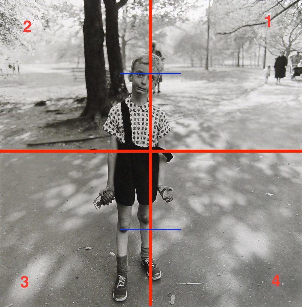
To the right we have another one of Diane Arbus's pictures, this time the famous boy with a toy grenade. Here we see that the boy is roughly center. Nothing else matters in the image. Our eyes will go from his face, to his hand and then those wonderfully knees.
The center of the image does not cut the boy in half. He is favorably positioned with room above his head and his feet near the bottom edge of the frame. This highlights his youth, the camera lens, tilted slightly down is indicative of the gaze an adult would have on a kid. This is not a menacing picture, we are in a position of power, and we can smile at this boys frustration with the photographer and with us. We are keeping him from playing. The background is boring and does not bring anything to the story. If he was playing with a group of kids, perhaps we would see them behind him changing the narrative of the image. But as it stands, we are left with the boy holding a grenade. |
|
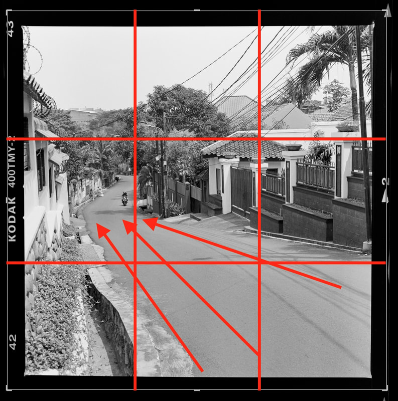
Here to the left we see another square format. The image of a road in Jakarta leading off the the distance uses a couple of overlapping compositional elements.
We have a square which forces us to look straight in the center of the image, but along the way our eyes follow leading lines into the distance and we see a man on a motorbike. Similar in placement to the first third of the image. Our eyes rest easy on this focus point before we look to the brighter portion of the images which is.the walls to the homes and sky. The overlapping compositional emelements allows us to overcome the strong urge to look to the center of the square.This is a key rule to use this composition. I you are going to place the subject outside of the very center, you need to really work to get the viewer to look there. Not at all impossible, but you need to provide the viewer with a reason. These can be leading lines, rule of thirds or the brighter portion of the tonality. But something that supports the viewer from moving away from the gravitational center of the image. |
|
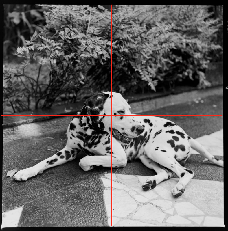
Finally we have a single subject and I place him in the center of the image. This is where he needs to sit. I even choose to sacrifice a portion of his tail so as to keep him center. There are no other compositional elements to lean on in order to change the perspective. Anything I can do will reduce the strength of the image.
So I opt to keep him in the center and leverage on the power of the square format to drive the viewer straight to the eye of the subject. I can take a step back, get the full tail in however the subject would shrink in size. The background is busy, distracting so best to try to fill as much of the frame as possible. Even then, we have the subject taking up about a third of the total frame but he seems bigger. That is the power of the square format. We will forget what is at the edges and the center pull is so strong, that subject will seem to overpower the rest. |
Symmetry regions within your frame,
A canvas of balance, devoid of blame.
Geometric beauty, stark and clear,
In every angle, a tale sincere.
Central subjects find their throne,
In the square's embrace, they're known.
Amidst the corners, harmony weaves,
A dance of form that subtly deceives.
No elongation, no stretch to distort,
Just a shape, concise and short.
In simplicity, a visual delight,
The square whispers elegance, pure and bright.
ChatGPT Poem..or a portion thereof.
