Everyone knows that bright color draws the human eye. This is why we like flowers, bright paint and colorful cell phone cases. So it makes sense that color would be a powerful compositional element however when does a color photograph turn into color being used to help compose the image?
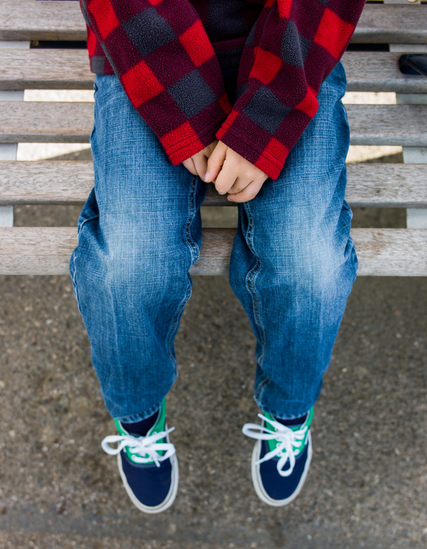
The photograph above is one of my youngest son. Here he is sitting on a bench waiting for a train. I composed the image to be an odd perspective to add a bit of interest. I removed the face and head to add some tension in the image. I was not worried about how the image would be pulled together because I knew I had some bright colors. The blue, red, white and green all with a backdrop of grey. Even the wooden slats of the chair have greyed with age.
His hands help give color some boundaries. This is an important element in my photographs if I use color as a compositional tool. The challenge is to use color but ensure that you do not abuse saturation or vibration of the photo. This makes the image appear fake and forced. The addition of his hands in the image shows the viewer that the color seen is very real with little done to emphasize it.
|
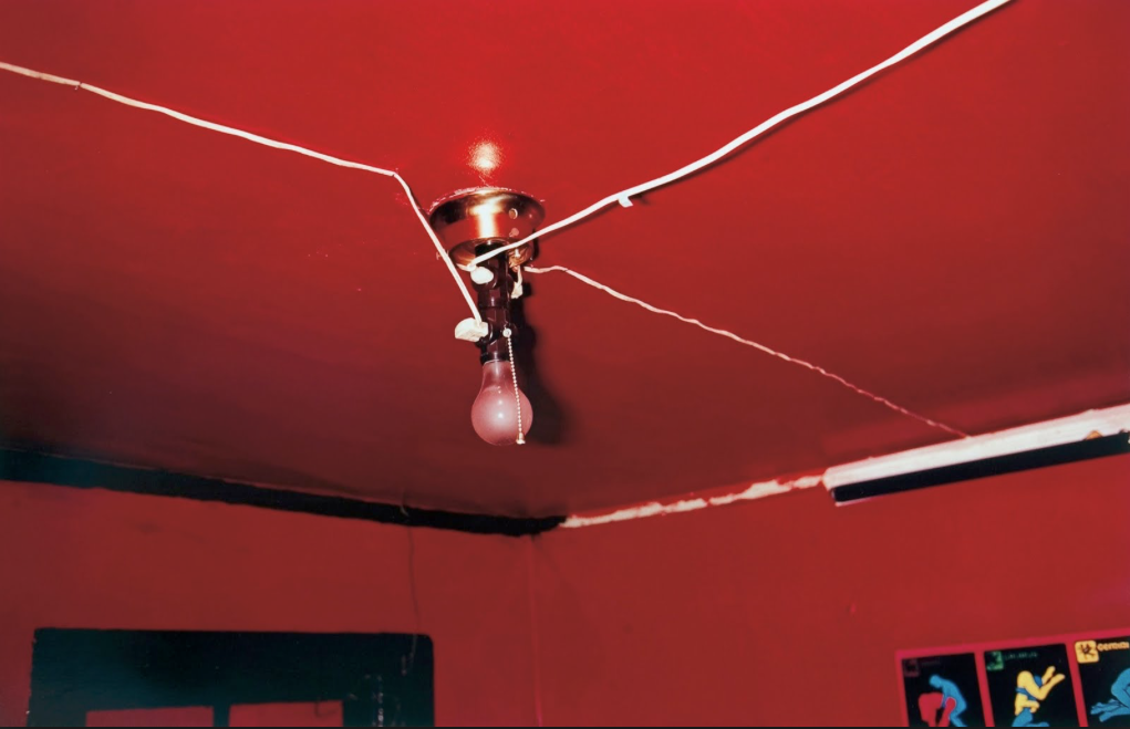
To the left we have an image shot by William Eggleston. It is one of his more famous images and one that the photographer has spoken about numerous times. Before we dive into what was really happening when the shot was taken let us consider the image in a vacuum.
Here we have a bare bulb attached with white wires crossing the ceiling. There is a poster of some referenced sexual positions with a dark door or window frame on the bottom left. Oh, yeah, I almost forgot, the entire room is painted blood red! It turns out the photographer was at a friends house with his friends wife sitting on their bed talking. He pointed his camera up and took the shot. |
|
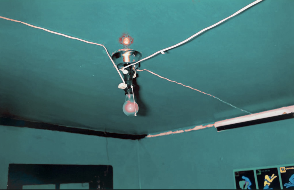
The interest of the image stems from the odd angle. The diagonal lines give the image a tension. The subject matter is a bit seedy, giving us an uncomfortable feeling. But the key to the image, the one thing that pulls it all together, is that color red. It is a picture that is seared into my minds eye because of that red. The emotion it conveys in the other part of the story, but that color is what makes this image. Here is an example of the same image with a crude alteration of color.
Not nearly as memorable. The color makes it appear more of common location and less menacing. The color, used properly, defines the picture in a unique way. |
|
|
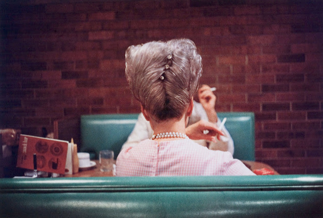
But anyone can grab a bold, deep color red and make a powerful image! But using color as a compositional tool does not require that the color be bold or strong. Here is an image, also by Eggleston, where his image is pulled together with teal.
We have the red brick in the background and the pink checkered blouse of the lady, tall grey, beehive hair with a repeating teal chair. The color of the chair and its texture defines the image and the place perfectly well. Again it is a photograph that tells a story but it is brought together with color. There is little else to help the composition as the figure is centered, face hidden and nothing really to guide the viewers eye, except for the color. |
|
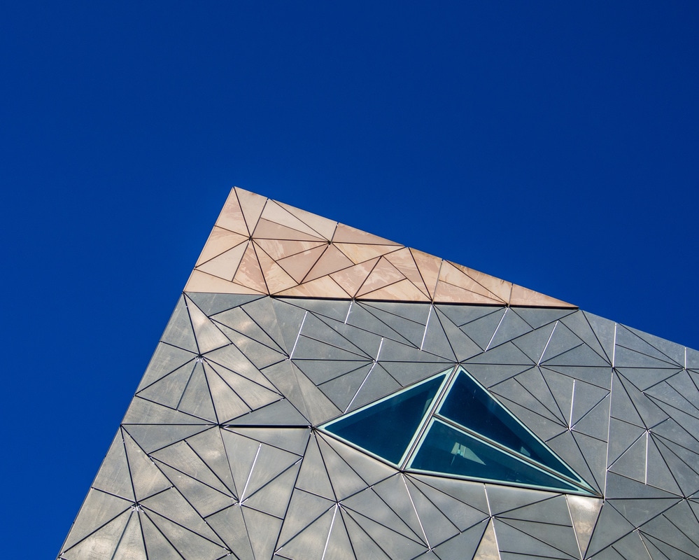
Here is a shot I took of the Museum of Modern Art in Melbourne Australia. The building is an odd shaped wonder which is not easy to capture. I opted for one of the points of the building and let the shiny gray and bronze color of the building stand out against the blue sky.
Here I used the blanket blue sky to draw the viewers attention to the edge of the building, this line of contrast makes the image. This same picture in B&W does not work nearly as well. The contrast is the same but they eye is lost in a dark gray while the blue helps focus the viewers attention better. This picture is designed for that rich, Australian, blue sky to be the balance for that oddly shaped structure. |
|
|
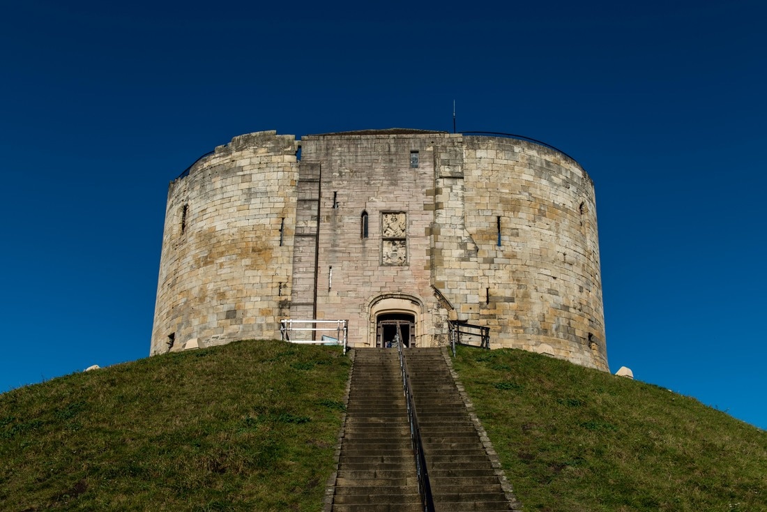
In this picture I am back in the old world, York England. Right in front of our hotel I saw this historic old tower. It is an amazing place which has seen an amazing amount of history. I wanted to capture it but could not find a way to do it easily. It is situated alone on top of a hill. During the usually cloudy days the tower is hidden due to the backdrop being of a similar contrast and color.
I waited for the clear day, early morning to get the sun just coming up behind me, no tourists running around and captured the picture. The white, blue and green make a very visually balanced image when in reality it is anything but. The leading lines of the stairs are all but lost do to the similar contrast to the grass. The tower is symmetrical but I believe that the colors are the image's strongest compositional element. |
Using color is a complicated compositional tool. Most photographs work best with color playing a supporting role in the image's composition. Using strong rule of thirds or symmetry along with eye arresting colors can create very powerful images. If there is a color with significant difference in illumination compared with the surrounding elements it can work nicely as well.
You will note that I did not add any images with selective coloring. While it is definitely a very strong compositional element, it has become a cheap trick to catch the tourist into buying something they will never hang. With everything in the image in B&W and one, single element in a bold color the human eye is drawn to it like a moth to a flame. Composition should be nuanced and the viewer should not be aware that their viewing is being manipulated. With selective color the photographer uses the equivalent of a cheap parlor trick to beat the viewer into the scene.
You will note that I did not add any images with selective coloring. While it is definitely a very strong compositional element, it has become a cheap trick to catch the tourist into buying something they will never hang. With everything in the image in B&W and one, single element in a bold color the human eye is drawn to it like a moth to a flame. Composition should be nuanced and the viewer should not be aware that their viewing is being manipulated. With selective color the photographer uses the equivalent of a cheap parlor trick to beat the viewer into the scene.
